In this post, I’d like to give you a sneak peek into what is the most complex part of Diagrams, namely the routing interactions and the algorithms beneath them.
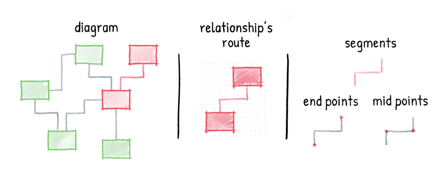
But first, let’s recap the meta-model and visualization principles outlined in the post about the app’s fundamentals. Every diagram you create in Diagrams consists of elements and relationships. These diagram objects are placed in the canvas and aligned to the ever-present grid. Consequently, the routes of all relationships have a shape of rectilinear paths going through the grid points. Each route is further divided into parts like segments, end points, and mid points as shown in the following overview.
If you hear the term routing algorithm you might think of automatic layout algorithms for graph visualization (like Graphviz). In general, those algorithms produce layouts for whole diagrams in a static manner without taking the user’s preferences into consideration. Although they can be integrated into interactive diagram editors where they can be triggered by a button click we strongly believe that they aren’t suited for such environments. Instead, we’re focusing on enabling smart interactions with diagram objects for performing individual layout operations. This is possible by leveraging the grid as mentioned before.
When a relationship between two elements gets created, its route is computed automatically. An existing route can then be adjusted indirectly or directly by the user. The indirect adjustment happens when one of the attached elements gets moved or when one end of the relationship gets re-attached to another element. The direct adjustment, on the other hand, happens when an inner part of the route (segment or mid point) is dragged to another position in the grid. The latter interaction is what we’re going to discuss here. In the following image, three sample cases of this interaction are shown. In each case, a mid point of the base route (thin) is dragged to a new position producing an adjusted route (bold).

The concept for this interaction has been evolving for the past few months and we went through many iterations along the way. What might seem very simple in the beginning becomes quite difficult once striving for an intuitive interaction which produces aesthetically pleasing results under all circumstances. While working on the initial research we analyzed our competitors. None of them offered a satisfying solution which confirmed our suspicions about how complex this topic is. The challenge was accepted!
After we made the initial drawings on paper, we looked for a way of putting the ideas into interactive prototypes. Unfortunately, this feature is so specific to our domain that the easiest way for us was to integrate it right into the application. When our ideas were confronted with the interactive environment and we had the chance to test them live for the first time, some assumptions were destroyed and we had to start working on the next iteration by incorporating what we had just learned. This process included reworking the concept, updating the implementation, and finally testing it live again.
We went through many iterations like this and I have to say it was pretty tedious work. We had to prepare concepts for individual route arrangements, ensure consistent behavior, and handle special cases (e.g. for routes covering attached elements or routes containing loops). The implementation was very math-heavy and it was often hard to wrap our heads around it, especially because it was changing that frequently. Visualization of the concepts was a helpful technique for us. In fact, we drew sketches on over 200 sheets of paper for this very feature, the route drag adjustment interaction.
After all this work and numerous alpha tests, we arrived at a promising result which includes some innovative concepts we haven’t seen anywhere else.
For example, we feature handles for route parts which have a unified look across points and segments. To increase the interactivity, those handles appear when hovering over the route parts and they change their appearance depending on the drag state.
We also took steps to improve the aesthetics of the resulting routes by reducing crossings with the attached elements and collapsing segments and eventual loops by visualizing the parts which will get cut off after completing the interaction.
Both concepts are demonstrated in the following recording of the development version of the app:
The final implementation is still in progress. In the next few weeks, we’ll handle even more edge cases, polish it and test it in an internal alpha version. After that, we’ll proceed with the interactions targeting the end points.
Are you curious about when you will be able to put your hands on it? We still don’t have a date but we’re slowly approaching the private alpha phase.


